Plot types
Each figure on this page was drawn by go-plot v0.1.0 from the code below it.
The code is not a copy: the page reads it from
figures/ in this
site’s repository, where go run . draws every image, and the CI draws them
again and fails if any differs from the one shown. linspace is a helper in
figures/main.go,
numpy.linspace’s equivalent.
| what | go-plot | matplotlib |
|---|---|---|
| lines and markers | Plot (17 markers, 4 line styles) | ax.plot |
| points | Scatter (size and colour per point, colormaps) | ax.scatter |
| bars | Bar, Barh | ax.bar, ax.barh |
| histograms | Hist | ax.hist |
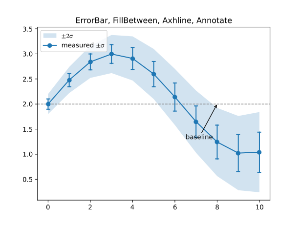
| bands, error bars | FillBetween, ErrorBar | ax.fill_between, ax.errorbar |
| reference lines | Axhline, Axvline | ax.axhline, ax.axvline |
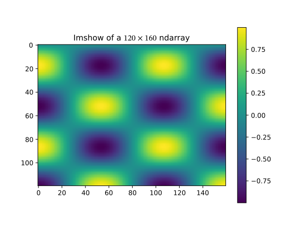
| images | Imshow (2-D data or RGB(A)) | ax.imshow |
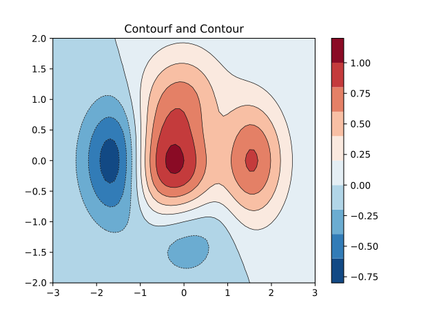
| contours | Contour, Contourf | ax.contour, ax.contourf |
| text | Text, Annotate | ax.text, ax.annotate |
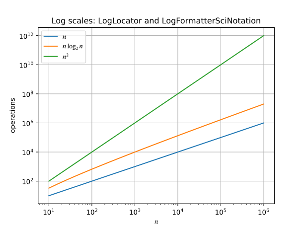
| scales, axes | SetXScale("log"), TwinX, SetXTicks, SetAspect | ax.set_xscale, ax.twinx, ax.set_xticks, ax.set_aspect |
| colour scale | Figure.Colorbar | fig.colorbar |
Lines and markers
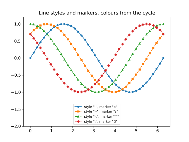
Plot draws a line in the next colour of the cycle. LineStyle takes "-",
"--", "-.", ":" (and "None"); Marker takes matplotlib’s marker codes.
package main

import (
	"math"

	"github.com/go-plot/plot"
)

func init() { register("lines", lines) }

func lines() *plot.Figure {
	x := linspace(0, 2*math.Pi, 40)
	styles := []string{"-", "--", "-.", ":"}
	markers := []string{"o", "s", "^", "D"}
	fig, axs := plot.Subplots(1, 1)
	ax := axs[0][0]
	for k := range styles {
		y := make([]float64, len(x))
		for i, v := range x {
			y[i] = math.Sin(v + float64(k)*math.Pi/4)
		}
		ax.Plot(x, y, plot.LineStyle(styles[k]), plot.Marker(markers[k]),
			plot.MarkerSize(4), plot.Label(`style "`+styles[k]+`", marker "`+markers[k]+`"`))
	}
	ax.SetTitle("Line styles and markers, colours from the cycle")
	ax.SetYLim(-2, 1.2)
	ax.Legend(plot.Loc("lower center"), plot.FontSize(8))
	return fig
}
Scatter
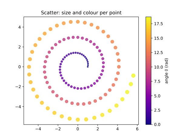
With CValues, colours come from a colormap and Scatter returns a
*Mappable for Colorbar. Sizes gives each point its area in points².
package main

import (
	"math"

	"github.com/go-plot/plot"
)

func init() { register("scatter", scatter) }

func scatter() *plot.Figure {
	n := 120
	x, y := make([]float64, n), make([]float64, n)
	c, s := make([]float64, n), make([]float64, n)
	for i := range n {
		t := float64(i) / float64(n) * 6 * math.Pi
		r := 1 + t/4
		x[i], y[i] = r*math.Cos(t), r*math.Sin(t)
		c[i] = t
		s[i] = 10 + 4*t
	}
	fig, axs := plot.Subplots(1, 1)
	ax := axs[0][0]
	m := ax.Scatter(x, y, plot.CValues(c), plot.Sizes(s), plot.Cmap("plasma"), plot.Alpha(0.8))
	ax.SetAspect(1)
	ax.SetTitle("Scatter: size and colour per point")
	fig.Colorbar(m, ax).SetYLabel(`angle $\theta$ (rad)`)
	return fig
}
Bars
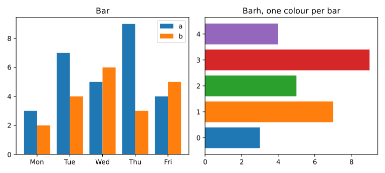
Bar draws bars 0.8 wide, centred on x, from 0; Width and an x offset put
two series side by side. Barh is the horizontal form, and Colors gives one
colour per bar.
package main

import "github.com/go-plot/plot"

func init() { register("bars", bars) }

func bars() *plot.Figure {
	x := []float64{0, 1, 2, 3, 4}
	a := []float64{3, 7, 5, 9, 4}
	b := []float64{2, 4, 6, 3, 5}
	fig, axs := plot.Subplots(1, 2, plot.FigSize(8, 3.6))
	left, right := axs[0][0], axs[0][1]
	left.Bar(x, a, plot.Width(0.4), plot.Label("a"))
	shifted := make([]float64, len(x))
	for i, v := range x {
		shifted[i] = v + 0.4
	}
	left.Bar(shifted, b, plot.Width(0.4), plot.Label("b"))
	left.SetXTicks([]float64{0.2, 1.2, 2.2, 3.2, 4.2}, "Mon", "Tue", "Wed", "Thu", "Fri")
	left.SetTitle("Bar")
	left.Legend()
	right.Barh(x, a, plot.Colors("C0", "C1", "C2", "C3", "C4"))
	right.SetTitle("Barh, one colour per bar")
	fig.TightLayout()
	return fig
}
Histograms
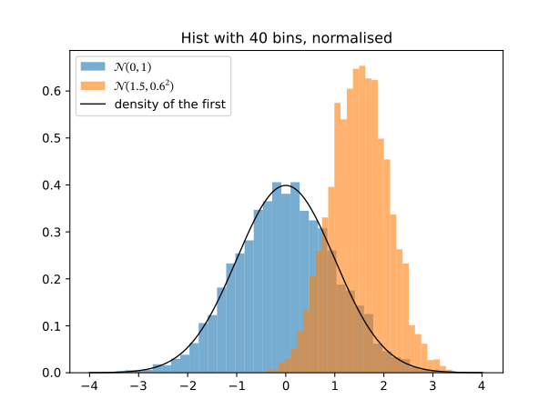
Hist bins with NumPy’s algorithm: 10 equal bins over the data range by
default, Bins(n) for n, BinEdges for explicit edges, Density to
normalise.
package main

import (
	"math"
	"math/rand/v2"

	"github.com/go-plot/plot"
)

func init() { register("hist", hist) }

func hist() *plot.Figure {
	rng := rand.New(rand.NewPCG(1, 2))
	a, b := make([]float64, 5000), make([]float64, 5000)
	for i := range a {
		a[i] = rng.NormFloat64()
		b[i] = 1.5 + 0.6*rng.NormFloat64()
	}
	fig, axs := plot.Subplots(1, 1)
	ax := axs[0][0]
	ax.Hist(a, plot.Bins(40), plot.Density(), plot.Alpha(0.6), plot.Label(`$\mathcal{N}(0, 1)$`))
	ax.Hist(b, plot.Bins(40), plot.Density(), plot.Alpha(0.6), plot.Label(`$\mathcal{N}(1.5, 0.6^2)$`))
	x := linspace(-4, 4, 200)
	pdf := make([]float64, len(x))
	for i, v := range x {
		pdf[i] = math.Exp(-v*v/2) / math.Sqrt(2*math.Pi)
	}
	ax.Plot(x, pdf, plot.Color("k"), plot.LineWidth(1), plot.Label("density of the first"))
	ax.SetTitle("Hist with 40 bins, normalised")
	ax.Legend()
	return fig
}
Error bars, bands and annotations
package main

import (
	"math"

	"github.com/go-plot/plot"
)

func init() { register("errorbar", errorbar) }

func errorbar() *plot.Figure {
	x := linspace(0, 10, 11)
	y, e := make([]float64, len(x)), make([]float64, len(x))
	for i, v := range x {
		y[i] = 2 + math.Sin(v/2)
		e[i] = 0.1 + 0.03*v
	}
	lo, hi := make([]float64, len(x)), make([]float64, len(x))
	for i := range x {
		lo[i], hi[i] = y[i]-2*e[i], y[i]+2*e[i]
	}
	fig, axs := plot.Subplots(1, 1)
	ax := axs[0][0]
	ax.FillBetween(x, lo, hi, plot.Alpha(0.2), plot.Label(`$\pm 2\sigma$`))
	ax.ErrorBar(x, y, plot.YErr(e), plot.CapSize(3), plot.Marker("o"), plot.Label(`measured $\pm\sigma$`))
	ax.Axhline(2, plot.Color("gray"), plot.LineStyle("--"), plot.LineWidth(1))
	ax.Annotate("baseline", 8, 2, 6.5, 1.3, plot.Arrow())
	ax.SetTitle("ErrorBar, FillBetween, Axhline, Annotate")
	ax.Legend(plot.Loc("upper left"))
	return fig
}
Images
Imshow colours 2-D data through a colormap (viridis by default), with pixel
centres at integer coordinates and row 0 at the top; a 3-D array of shape
(rows, cols, 3 or 4) is shown as RGB(A). Here the data is a go-ndarray
array.
package main

import (
	"math"

	"github.com/go-ndarray/ndarray"
	"github.com/go-plot/plot"
)

func init() { register("imshow", imshow) }

func imshow() *plot.Figure {
	const rows, cols = 120, 160
	data := make([]float64, rows*cols)
	for i := range rows {
		for j := range cols {
			data[i*cols+j] = math.Sin(float64(i)/11) * math.Cos(float64(j)/17)
		}
	}
	z, err := ndarray.FromSlice(data, rows, cols)
	if err != nil {
		panic(err)
	}
	fig, axs := plot.Subplots(1, 1)
	ax := axs[0][0]
	m := ax.Imshow(z, plot.Cmap("viridis"))
	fig.Colorbar(m, ax)
	ax.SetTitle(`Imshow of a $120 \times 160$ ndarray`)
	return fig
}
Contours
Contour draws iso-lines and Contourf fills the bands between them, at
levels chosen as matplotlib chooses them (ContourSet._autolev). x and y give
the column and row coordinates.
package main

import (
	"math"

	"github.com/go-plot/plot"
)

func init() { register("contour", contour) }

func contour() *plot.Figure {
	x, y := linspace(-3, 3, 61), linspace(-2, 2, 41)
	z := make([][]float64, len(y))
	for i, v := range y {
		z[i] = make([]float64, len(x))
		for j, u := range x {
			z[i][j] = (1-u/2+math.Pow(u, 5)+math.Pow(v, 3))*math.Exp(-u*u-v*v)
		}
	}
	fig, axs := plot.Subplots(1, 1)
	ax := axs[0][0]
	m := ax.Contourf(x, y, z, plot.NLevels(10), plot.Cmap("RdBu_r"))
	ax.Contour(x, y, z, plot.NLevels(10), plot.Color("k"), plot.LineWidth(0.5))
	fig.Colorbar(m, ax)
	ax.SetTitle("Contourf and Contour")
	return fig
}
Log scales
SetXScale("log") and SetYScale("log") use matplotlib’s LogLocator and
LogFormatterSciNotation, so the decades and their labels are matplotlib’s.
package main

import (
	"math"

	"github.com/go-plot/plot"
)

func init() { register("loglog", loglog) }

func loglog() *plot.Figure {
	n := linspace(1, 6, 26)
	x := make([]float64, len(n))
	for i, e := range n {
		x[i] = math.Pow(10, e)
	}
	lin, nlogn, sq := make([]float64, len(x)), make([]float64, len(x)), make([]float64, len(x))
	for i, v := range x {
		lin[i], nlogn[i], sq[i] = v, v*math.Log2(v), v*v
	}
	fig, axs := plot.Subplots(1, 1)
	ax := axs[0][0]
	ax.Plot(x, lin, plot.Label(`$n$`))
	ax.Plot(x, nlogn, plot.Label(`$n \log_2 n$`))
	ax.Plot(x, sq, plot.Label(`$n^2$`))
	ax.SetXScale("log")
	ax.SetYScale("log")
	ax.Grid(true)
	ax.SetXLabel(`$n$`)
	ax.SetYLabel("operations")
	ax.SetTitle("Log scales: LogLocator and LogFormatterSciNotation")
	ax.Legend()
	return fig
}
Two y axes
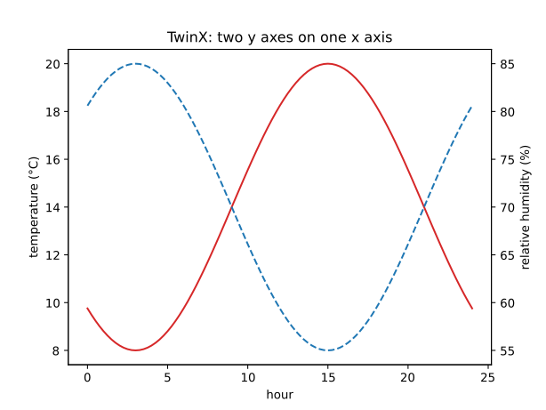
TwinX returns a new Axes sharing the x axis, with its y axis on the right and
its own colour cycle.
package main

import (
	"math"

	"github.com/go-plot/plot"
)

func init() { register("twinx", twinx) }

func twinx() *plot.Figure {
	t := linspace(0, 24, 97)
	temp, hum := make([]float64, len(t)), make([]float64, len(t))
	for i, v := range t {
		temp[i] = 14 + 6*math.Sin((v-9)*math.Pi/12)
		hum[i] = 70 - 15*math.Sin((v-9)*math.Pi/12)
	}
	fig, axs := plot.Subplots(1, 1)
	ax := axs[0][0]
	ax.Plot(t, temp, plot.Color("C3"))
	ax.SetXLabel("hour")
	ax.SetYLabel("temperature (°C)")
	right := ax.TwinX()
	right.Plot(t, hum, plot.Color("C0"), plot.LineStyle("--"))
	right.SetYLabel("relative humidity (%)")
	ax.SetTitle("TwinX: two y axes on one x axis")
	return fig
}
A grid, with TightLayout
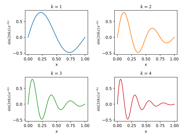
Subplots(rows, cols) lays out a grid with matplotlib’s subplot parameters;
TightLayout then moves the Axes so that titles and labels do not overlap.
package main

import (
	"math"

	"github.com/go-plot/plot"
)

func init() { register("grid", grid) }

func grid() *plot.Figure {
	x := linspace(0, 1, 200)
	fig, axs := plot.Subplots(2, 2)
	for r := range 2 {
		for c := range 2 {
			k := float64(1 + 2*r + c)
			y := make([]float64, len(x))
			for i, v := range x {
				y[i] = math.Sin(2*math.Pi*k*v) * math.Exp(-k*v)
			}
			ax := axs[r][c]
			ax.Plot(x, y, plot.Color("C"+string(rune('0'+2*r+c))))
			ax.SetTitle(`$k = ` + string(rune('0'+int(k))) + `$`)
			ax.SetXLabel("x")
			ax.SetYLabel(`$\sin(2\pi k x)\,e^{-kx}$`)
		}
	}
	fig.TightLayout()
	return fig
}
Created on by tannevaled
Modified on by tannevaled